
Giol Wine Redesign
Packaging and Branding – Equator Design Co-op Spring 2023
Giol is one of Italy’s oldest and most beloved wineries. For this personal, conceptual project, I redesigned the branding and wine labels for Giol as if it were being brought into the American market. Completed during my Co-op semester at Equator Packaging Design, I utilized Equator’s entire creative process, which I was exposed to within other client projects. I also got to work with food photography, and art directed the photoshoot for this project.
I had the wonderful opportunity to study abroad in Florence, Italy during the Fall semester of 2022, where I grew so much as a person and as a designer. This experience inspired me to create a project reflecting my new understanding of the Italian culture and their respect for the good moments in life, such as enjoying a nice bottle of wine!


Final Branding

Primary Logo
Secondary Logos

Logomarks
Visual System


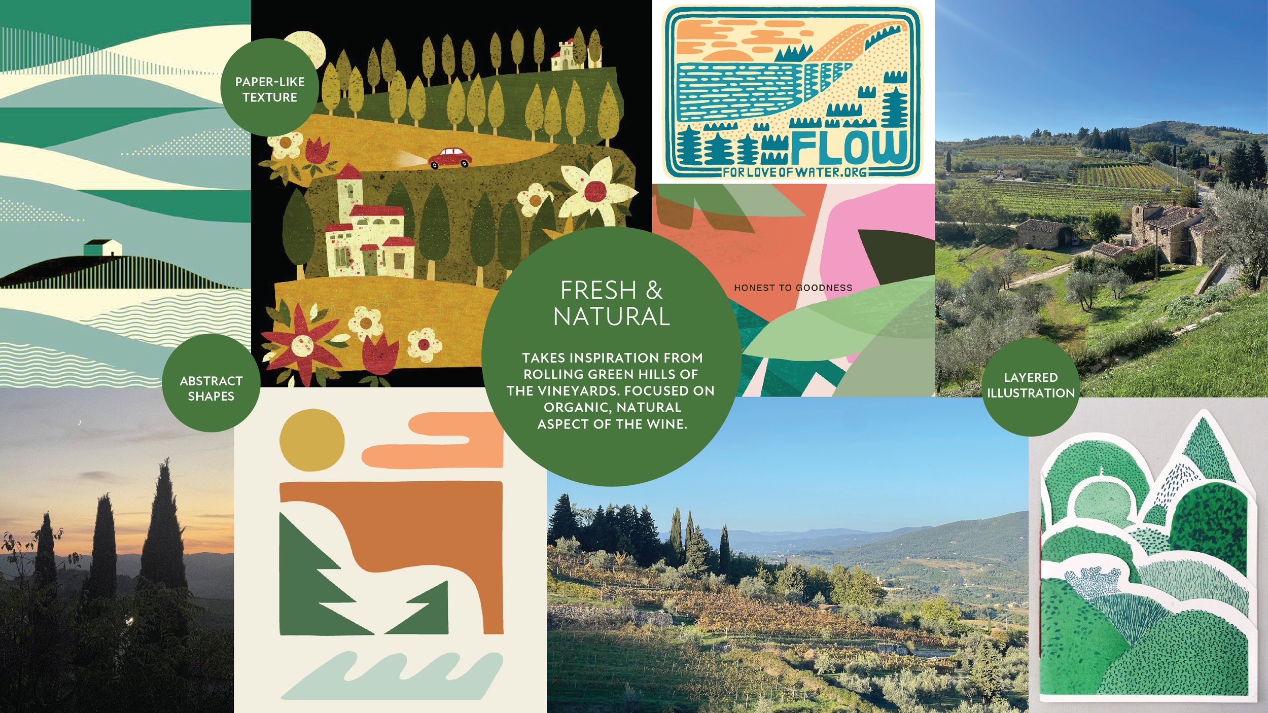
The Process
Existing

Market Audit

Target Audience
Young adults age 25-40
Americans
Seeking quality, healthy wine
Cares about the environment
Nature lovers & adventure seekers
Appreciates other cultures
Values authenticity & community
Believes there is no end to learning

Process


Label Concept 1


Label Concept 2


Chosen Label Design Finals

Materials
Focusing back onto the target audience’s goals and values, the materials for Giol’s wine labels will be a eco-friendly, compostable and biodegradable paper. Any Giol box or bag will also be made of recyclable materials, such as Kraft paper.

Photography
Equator Design is home to a renowned food photography studio, where I was able to shadow art direction on many varying client projects. For Giol wine labels, I had the opportunity to practice what I have learned, and art direct the product photography, collaborating with the photography Co-op student.
Photography done by Madison Ashe – www.madisonasheart.com


